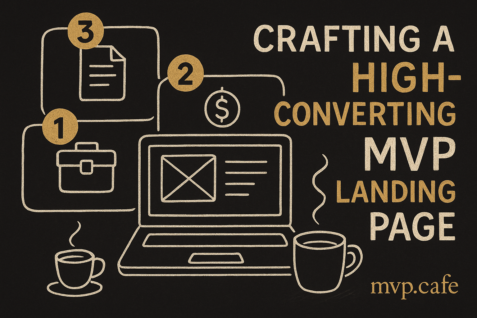
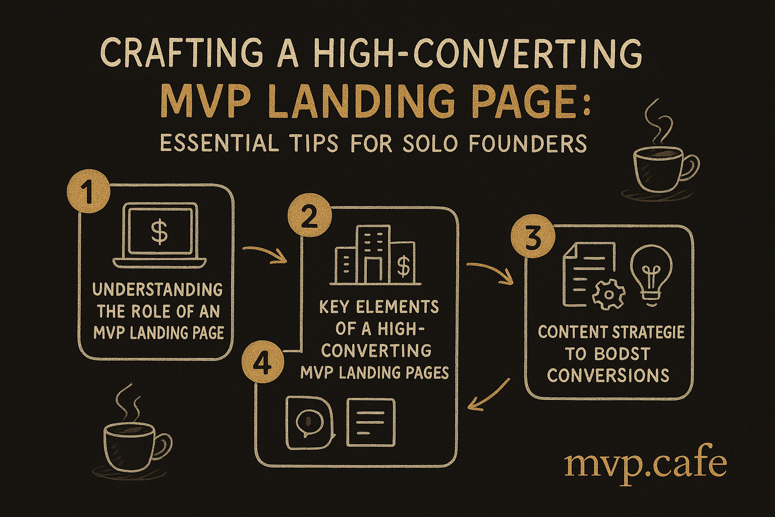
Understanding the Role of an MVP Landing Page
In the chaotic world of startups, the MVP (Minimum Viable Product) landing page is your first real introduction to potential customers. It’s more than just a digital brochure—it’s your pitch, your handshake, your first impression bundled into one. Especially for solo founders, this page is a make-or-break moment. You’re not just up against the big fish; you’re competing with other hungry startups all eyeing the same crowd of early adopters.
Think of an MVP landing page as your online elevator pitch. It’s got to communicate your core value proposition clearly and succinctly. It’s also your tool for collecting user feedback, that invaluable input which helps you iterate and improve. Without this feedback, you’re operating in the dark.
For solo founders, the challenges are real. With limited resources, hiring a full design team or running extensive A/B tests like the big guys isn’t feasible. You’re likely wearing multiple hats—design, copywriting, user acquisition—all at once. This juggling act can lead to pages that lack clarity or miss the mark with your audience. But don’t worry. With the right tactics, even a solo founder can craft an MVP landing page that punches way above its weight.
Read more about the critical role of MVPs in startup success.
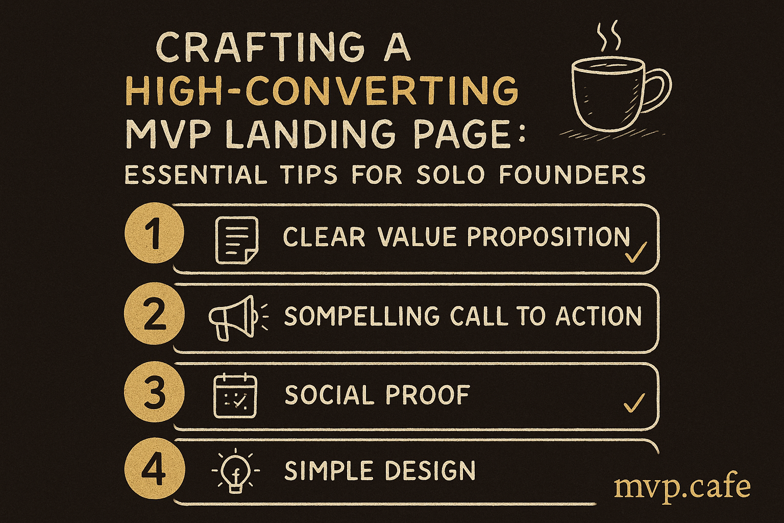
Key Elements of a High-Converting MVP Landing Page
You want your MVP landing page to do more than just look good—you want it to convert. Here’s what needs to be there:
-
Compelling Headline and Subheadline: Your headline is your hook. It should immediately tell users the main benefit of your product. Subheadlines give a little more detail to reel them in.
-
Clear Value Proposition: In just a few seconds, visitors should grasp why your product matters. What’s the problem you’re solving for them?
-
Strong Call-to-Action (CTA): The CTA is where the magic happens. “Sign Up Now” or “Learn More”—whatever it is, make sure it stands out and urges action.
-
Trust Signals and Social Proof: Testimonials, user reviews, media mentions—these build trust. People are more likely to believe in your product if others vouch for it.
Here’s a [checklist of essential MVP landing page elements]
Design Tips for Optimizing MVP Landing Pages
Design can truly make or break your landing page. Here’s how to get it right:
-
Simplicity and Focus: Keep your design clean. Every section should serve a clear purpose. Don’t clutter it with unnecessary bells and whistles.
-
Mobile-Friendly Design: With over half of web traffic coming from mobile devices, your page needs to look slick everywhere. Responsive design isn’t just nice to have—it’s a must.
-
Visual Hierarchy and Eye-Tracking: Use size, color, and placement to lead users’ eyes to what matters most, like your CTA. Eye-tracking studies show users follow predictable patterns. Leverage that.
-
Utilizing Whitespace: Whitespace isn’t just empty space. It highlights important content and enhances readability, keeping viewers from getting overwhelmed.
Here’s a [framework for strategic MVP landing page design]
Content Strategies to Boost Conversions
Design sets the stage, but content does the heavy lifting:
-
Persuasive Copy: Talk directly to your audience’s needs. Use active language. Highlight benefits over features.
-
Customer Testimonials: Real users’ voices can be incredibly convincing. Make these testimonials visible.
-
Multimedia Elements: Videos, infographics, animations—they can quickly and engagingly convey ideas. Just make sure they don’t slow down your page.
-
A/B Testing: Constantly test different content versions to see what hits home with your audience. Even small tweaks can lead to big results.
Real-World Examples and Case Studies
Let’s dive into some real-world successes:
-
ZYOD’s Strategic Design Choices: By focusing on a clear value proposition and strong CTAs, ZYOD saw a significant uptick in user engagement. Their approach could be a template for other solo founders. Learn more about ZYOD’s strategic design choices.
-
GoMechanic’s MVP Landing Page: By putting a spotlight on user testimonials and simplifying design, GoMechanic achieved impressive conversion rates. The takeaway? Simplicity combined with strong social proof delivers results.
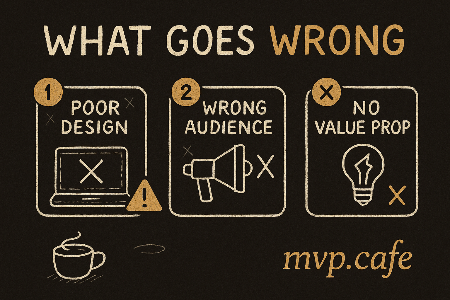
Avoiding Common Pitfalls in MVP Landing Page Design
Steer clear of these pitfalls to keep your landing page on track:
-
Overloading with Information: Less is often more. Stick to the essentials and cut out anything that doesn’t serve your main goal.
-
Neglecting Mobile Optimization: A desktop-only approach is a sure way to lose potential customers. Test across multiple devices.
-
Ignoring Analytics and User Feedback: Data is your friend. Use analytics to see where visitors are dropping off and feedback to find out what needs tweaking.
-
Failing to Update and Iterate: Your first version won’t be perfect. Use insights from analytics and feedback to keep refining your page.
Checklist for Crafting Your MVP Landing Page
Don’t hit publish until you’ve checked these boxes:
-
Pre-launch: Ensure clarity, mobile compatibility, and load speed. Double-check all links and CTAs.
-
Post-launch Optimization: Keep an eye on analytics, gather feedback, and be ready to make adjustments.
-
Continuous Improvement: Regularly update content and design based on user behavior and feedback.
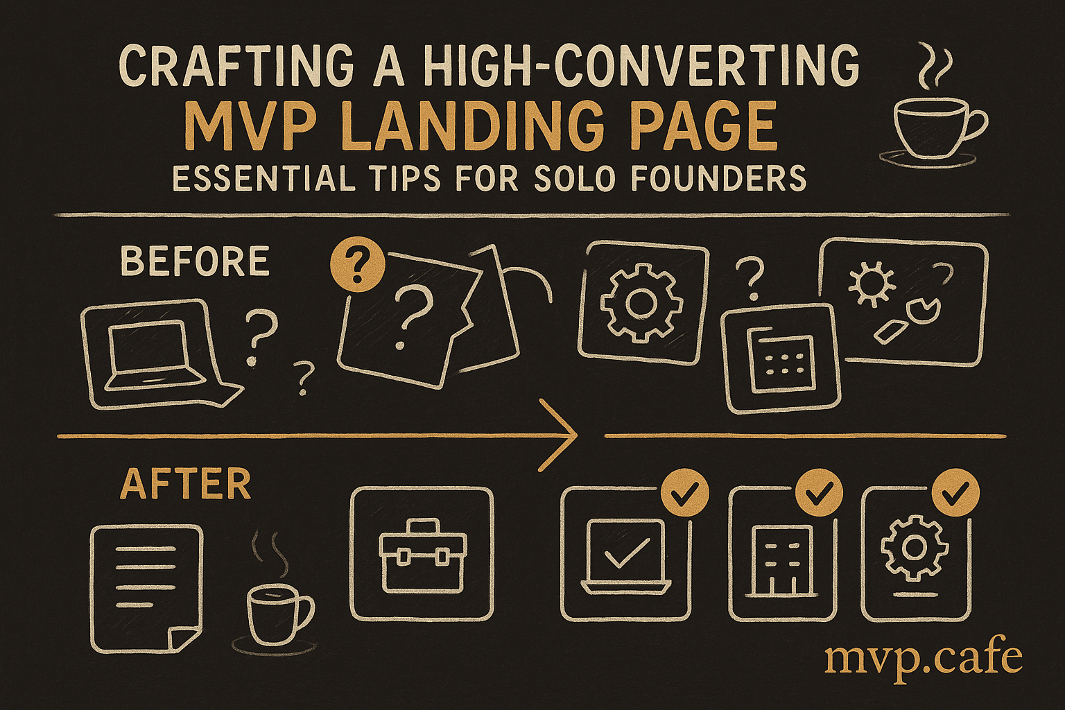
Creating a high-converting MVP landing page as a solo founder is tough but totally doable. Focus on clarity, design, and content—you’ll be ready for success.