---
title: "Crafting an MVP Analytics Dashboard for Investor Demos: Key Metrics and Presentation Strategies for 2026"
description: "Learn how to craft an MVP analytics dashboard with key metrics and presentation strategies to impress investors in 2026."
pubDate: 2026-06-04
author: Aman Jha
image: /images/mvp-analytics-dashboard.jpg
ogImage: /images/mvp-analytics-dashboard-og.jpg
template: tool-post
tags: [MVP, Analytics, Investor Demos, Metrics, Dashboard]
keywords: [MVP analytics dashboard, investor demo metrics, key metrics for MVP, MVP traction metrics, building MVP dashboards, effective MVP presentation, investor-ready MVP analytics, demonstrating MVP traction]
targetICP: solo
draft: false
faq:
- question: "What metrics should be included in an MVP analytics dashboard?"
answer: "Include metrics like customer acquisition cost, churn rate, and monthly recurring revenue to demonstrate traction."
- question: "How do you present an MVP to investors?"
answer: "Use compelling narratives, clear visuals, and highlight key metrics that align with investor interests."
- question: "What are key performance indicators for MVPs?"
answer: "KPIs for MVPs include user growth rate, engagement metrics, and customer satisfaction scores."
- question: "How can an MVP dashboard demonstrate traction?"
answer: "Dashboards visually represent progress and potential through clear metrics and trends over time."
- question: "Why is it important to have an MVP analytics dashboard?"
answer: "Dashboards play a crucial role in securing investor confidence by clearly showing traction and future potential."
---
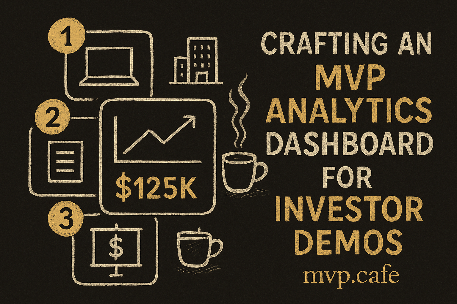
## Understanding the MVP Analytics Dashboard
Picture this: you're walking into a room full of investors, excited but armed only with enthusiasm and a vague idea of your product's performance. Not the best way to win confidence, right? Enter the **MVP analytics dashboard**—your ace in the hole for demonstrating traction and potential.
<figure>
<img src="/blog/inline/mvp-analytics-dashboard-for-investor-demos-what-m/fig-01-framework.png" alt="The core framework" />
<figcaption>The core framework</figcaption>
</figure>
An MVP analytics dashboard isn't just a collection of numbers; it's a storytelling tool that showcases your product's journey and potential. Investors are looking for proof that your MVP is more than just an idea—it's a real business opportunity.
In investor presentations, this dashboard is your best friend. It provides hard evidence of your product's success and future potential, helping to build trust. Need more on why metrics matter? Check out our [insights on the importance of metrics](/insights/importance-of-metrics). [INLINE IMAGE: framework — Diagram of MVP analytics dashboard components]
## Selecting Key Metrics for Your MVP
Choosing the right metrics is like picking the right spices for a dish. Get it wrong, and the flavor's off. For your MVP, metrics need to align with your goals and what investors expect.
<figure>
<img src="/blog/inline/mvp-analytics-dashboard-for-investor-demos-what-m/fig-02-failure-modes.png" alt="Common failure modes" />
<figcaption>Common failure modes</figcaption>
</figure>
Start with **customer acquisition cost** and **churn rate**. These metrics are crucial for showcasing how well you're gaining and keeping users. Don't forget **monthly recurring revenue (MRR)**—it's a big one for showing steady income potential.
From my days at GoMechanic, I've seen how combining **lifetime value (LTV)** with acquisition costs can spotlight profitability. It's a powerful mix. The goal is to select metrics that paint a clear picture of growth and sustainability.
## Building an Effective MVP Dashboard
Let's talk about putting that dashboard together. First up, get a solid base. Tools like Google Data Studio or Tableau are perfect for crafting interactive dashboards. They’re flexible with design and data integration.
<figure>
<img src="/blog/inline/mvp-analytics-dashboard-for-investor-demos-what-m/fig-03-before-after.png" alt="Before vs after" />
<figcaption>Before vs after</figcaption>
</figure>
When I was at ZYOD, we zeroed in on dashboards that were both data-rich and easy to use. Keep it simple. Use clear visuals and avoid crowding it with data. A good dashboard should convey critical info in a glance.
Need professional help? See how [mvp.cafe can help](/services/works) create the perfect dashboard for you. [INLINE IMAGE: data-viz — Data visualization of tool usage statistics]
## Strategies for Presenting Your MVP Dashboard to Investors
You’ve got the data. Now, make it sing. Start with a compelling narrative. Link your metrics to the bigger picture. Why do they matter, and what do they mean for the future?
<figure>
<img src="/blog/inline/mvp-analytics-dashboard-for-investor-demos-what-m/fig-04-checklist.png" alt="Action checklist" />
<figcaption>Action checklist</figcaption>
</figure>
For visual presentations, keep it clean and uncluttered. Use graphs and charts to highlight trends. In presentations at GoMechanic, we found that minimal text and impactful visuals in a slide deck kept investors engaged.
Highlight success stories. Share examples where metrics turned into insights and positive outcomes. This adds credibility and showcases your strategic mindset.
## Common Pitfalls and How to Avoid Them
Let’s be real: not every dashboard hits the mark. Common traps include using misleading metrics or making your dashboard too complex. Simplicity and honesty work best here.
I've seen dashboards overloaded with information that end up confusing investors instead of impressing them. Clarity is key. And please, listen to investor feedback. It’s a treasure trove for improvement. [INLINE IMAGE: iceberg — Iceberg of common pitfalls in MVP dashboards]
## Checklist for Investor-Ready MVP Analytics
Before you head into that investor meeting, check off this list:
- Make sure all metrics are current and accurately reflect your MVP's performance.
- Double-check the clarity and relevance of your visuals.
- Prepare a narrative that ties your metrics to your product’s future potential.
A well-prepared dashboard can be the difference between securing that funding and walking away empty-handed. Past pitch success stories prove that preparation is worth it. [INLINE IMAGE: checklist — Final checklist for MVP dashboards]
---
Creating an MVP analytics dashboard isn't just about the numbers—it's about crafting a story that convinces investors your MVP deserves their time and money. Need more guidance on building your MVP? A strategy sprint with us at mvp.cafe might just do the trick.Frequently Asked Questions
What metrics should be included in an MVP analytics dashboard?
List essential metrics and explain their importance.
How do you present an MVP to investors?
Outline key strategies and tips for effective presentation.
What are key performance indicators for MVPs?
Define KPIs and provide examples relevant to MVPs.
How can an MVP dashboard demonstrate traction?
Explain how dashboards can visually represent progress and potential.
Why is it important to have an MVP analytics dashboard?
Discuss the role of dashboards in securing investor confidence.