Most MVP teams obsess over the happy path. The dashboard after data exists. The project page after a project is created. The analytics screen after events are flowing. The customer list after the first import works.
Then the first real user signs in and sees nothing.
No projects. No customers. No charts. No activity. No tasks. No search results. No integrations. No history.
That is not a rare edge case. For a new product, the empty state is often the first product experience.
If that screen says “No data found,” the user has to do the product thinking by themselves. They must infer what the screen is for, what data is missing, why it matters, and what they should do next. Most will not bother. They will click around, feel the product is unfinished, and leave with the quiet but deadly conclusion: “I don’t get it.”
An MVP empty state has one job: convert a blank product moment into a guided product moment.
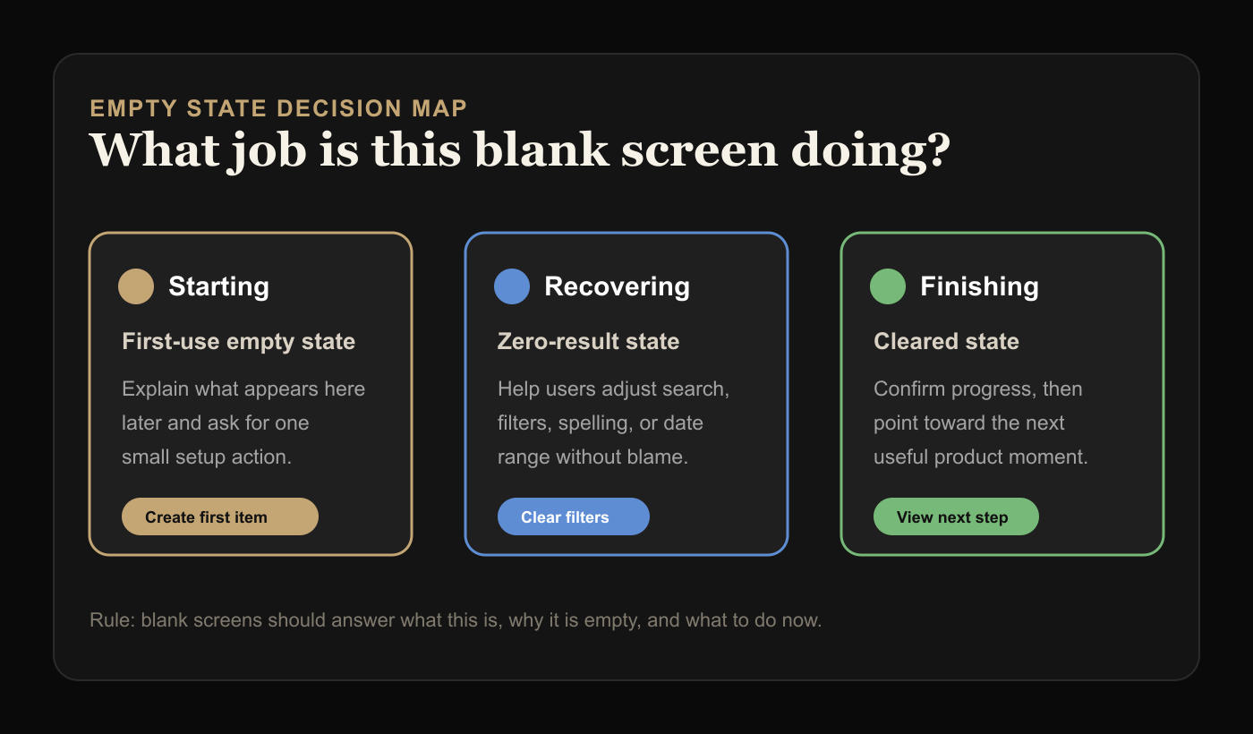
The Three Empty States Every MVP Has
Not all empty states are the same. Treating them as one generic component is how products end up with useless messages like “Nothing here yet.”
There are three common types.
First-use empty states appear before the user has created anything. These need to explain the value of the area and push one obvious first action.
Zero-result empty states appear after a user searches, filters, or applies a condition that returns nothing. These need to help the user recover, not make them feel wrong.
Cleared-state empty states appear after a user completes or removes everything. These should confirm progress and guide what comes next.
The same visual shell can be reused, but the message cannot. “Create your first project” makes sense on a first-use dashboard. It is nonsense after someone searches for a customer and gets no matches.
The Blank Screen Test
Open your MVP in a fresh account. Remove all demo data. Now visit every primary page.
Ask three questions:
- Does this screen explain what will appear here later?
- Does it explain why the user should care?
- Does it give one useful next action?
If the answer is no, the feature is not really done. The backend may work. The UI may render. But the product has not helped a new user cross the first gap.
This matters more in MVPs than mature products because mature products can lean on existing data. A CRM with years of customers does not show the empty customer screen often. A new CRM shows it to every new user.
The lower your product maturity, the more important your empty states become.
The Best Empty States Have Four Parts
You do not need a fancy illustration system. You need a useful pattern.
Start with a specific title. Avoid “Nothing here yet.” Say what is missing in product language: “No customers imported yet,” “No campaigns created yet,” or “No invoices match this filter.”
Add one line of context. Explain what this area helps the user do once it has data. Keep it grounded. “Track every customer conversation in one place” is better than “Unlock powerful relationship intelligence.”
Give one primary action. Not three. Not a row of buttons. One action that moves the user forward.
Offer a secondary escape only when useful. For zero-result states, this might be “Clear filters.” For first-use states, it might be “View an example.” For cleared states, it might be “Go back to dashboard.”
That is enough.
Title: No customer calls logged yet
Context: Calls you log here will show follow-ups, objections, and buying signals.
Primary action: Add first call note
Secondary escape: Import notes from CSV
Notice what this does not include: a paragraph about the product vision, a generic motivational quote, or four actions that all compete for attention.
The CTA Should Match User Readiness
Bad empty states over-ask.
If a user has just signed up, “Connect Salesforce, invite your team, import customers, configure workspace, and create your first workflow” is not onboarding. It is a chore list disguised as product design.
Match the next action to the user’s current readiness.
For a brand-new user, ask for the smallest meaningful setup action. Create one project. Add one customer. Upload one file. Write one prompt. Connect one source.
For a user who has already configured the product, ask for the action that creates value. Run first report. Send first invite. Review first result. Publish first page.
For a user who hit zero results, help them recover. Clear filters. Widen date range. Check spelling. Create a new item if the absence is expected.
The mistake is treating every empty state as a conversion opportunity. Some are orientation moments. Some are recovery moments. Some are reassurance moments.
The button should reflect that.
Do Not Use Demo Data as a Crutch
Demo data can help users understand a complex product, but it often hides broken empty states during development.
Teams build against a seeded database, screenshots look alive, and everyone forgets the real first account starts with nothing.
If you use demo data, make the mode obvious. “Example dashboard” is fine. Fake live activity is not. Users should know whether they are looking at their data or sample data.
A better pattern for MVPs is usually a lightweight example preview plus a real next action:
No reports yet

Reports will show weekly conversion, drop-off, and activation changes.

[Create first report]

Want to see the shape first? View example report.
This teaches without pretending.
Empty States Are Also Product Strategy
Empty states expose whether the team understands the product’s first value moment.
If nobody can write a clear empty state, that usually means nobody has agreed on what the user should do first.
For example:
No workflows yetThat message is technically accurate but strategically lazy. What kind of workflow? Why create one? What does success look like?
Better:
No approval workflow yet

Create one workflow to route purchase requests to the right approver before they get lost in chat.

[Create approval workflow]
Now the product has a point of view. It is not just saying “use this feature.” It is saying “this feature prevents this specific operational mess.”
That is the difference between UI copy and product thinking.
A Simple Empty-State Checklist
Before shipping any MVP screen, review every empty state against this checklist:
- The title names the missing object or result.
- The body explains the future value in one sentence.
- The primary action is singular and concrete.
- The action creates real product progress.
- Zero-result states help users recover.
- Cleared states acknowledge completion.
- The screen does not rely on decorative copy to hide confusion.
- Demo data is clearly labeled if used.
- The empty state works on mobile.
- The screen was tested in a fresh account.
That last point is the one teams skip. Do not review empty states inside a developer account filled with fixtures. Create a new account and experience the product from zero.
Examples You Can Adapt
For a project management MVP:
No projects yet

Projects help you group tasks, files, and decisions around one outcome.

[Create first project]
For a metrics dashboard:
No events received yet

Once your app sends events, this dashboard will show activation, retention, and drop-off.

[Copy tracking snippet]
For a search result:
No customers match this filter

Try clearing filters or expanding the date range.

[Clear filters]
For a task list after completion:
All launch tasks are done

You have completed the current checklist. Review launch metrics next.

[View launch dashboard]
Each one is short. Each one tells the user where they are. Each one gives a next step.
The MVP Rule
If a blank screen makes users feel lost, the product is leaking trust.
You do not need to over-design it. You just need to answer the user’s silent questions:
What is this place?
Why is it empty?
What should I do now?
Get those three right and the empty state stops being a dead end. It becomes part of activation.
For a broader readiness check, use the free Build Score and treat empty states as one of the first-experience gaps worth fixing before launch.