Zevras
An anti-tarnish jewelry brand had Instagram followers and 110K-view reels — but every sale happened through WhatsApp DMs. Built the complete e-commerce experience they needed.
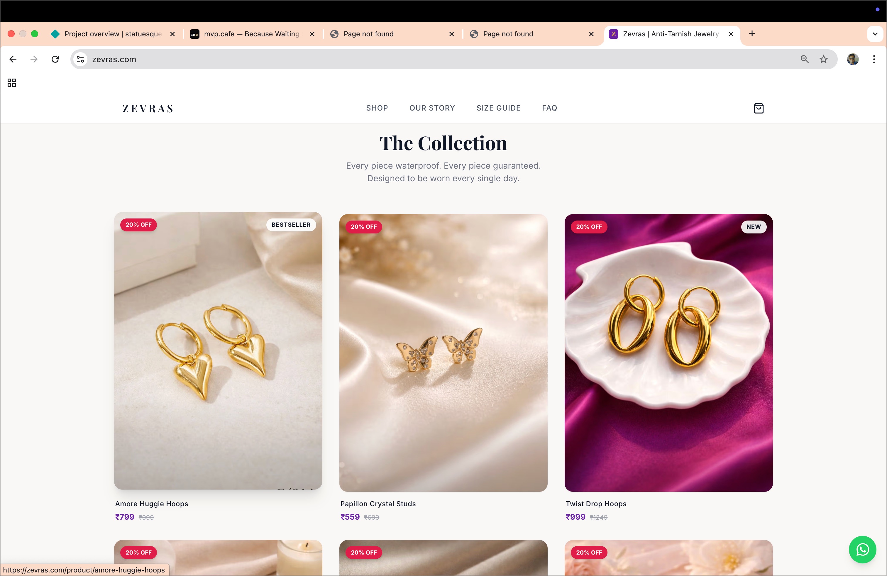
Zevras sells PVD-coated, anti-tarnish jewelry — pieces that actually survive daily wear. The brand had an Instagram presence with reels hitting 110K+ views and a growing following. But every sale was a WhatsApp DM. Customer sends "interested," owner shares price, payment via UPI screenshot, manual address collection, manual shipping.
That works for 10 orders a month. It breaks at 50. And it completely fails at building a brand — because there's no storefront, no product pages, no browsing experience. The brand existed only in Instagram stories and chat windows.
Every decision had a reason.
Mobile-first, not mobile-friendly
95% of Zevras traffic comes from Instagram. That means mobile. Not "responsive" — mobile-first. Every element designed for thumb reach, every CTA sized for tap, every image optimized for cellular.
Experience connection: Led the GoMechanic iOS app — learned that mobile users don't pinch-zoom and don't scroll sideways. If it's not obvious on first load, it doesn't exist. Applied the same principle: sticky CTAs, no hover states (caused a two-tap bug on mobile that we caught and killed), 3:4 product image ratios for tall mobile viewports.


COD + prepaid nudge — not either/or
In Indian D2C, COD is still king for first-time buyers. Refusing COD kills conversion. But COD has 25-30% RTO (return to origin) rates and locks up cash. Most brands pick a side. We did both — with a nudge.
5% extra discount for online payment. Stacks with promo codes. This shifts the economics: every prepaid order saves ~₹100 in shipping risk and frees up working capital immediately.
Experience connection: At ZYOD, built a QR-code based WMS that unlocked ₹11-12 Cr in blocked working capital. Same principle here at micro-scale — COD blocks cash, prepaid frees it. Also drew from ZeoAuto (YC W20) pricing strategy work: small financial nudges change user behavior more than big UI changes.
Free shipping threshold + cart drawer
Slide-out cart drawer instead of a separate page — keeps the buyer on the product page, reduces friction. Inside: a progress bar showing how close they are to free shipping (₹1,000 threshold).
Average product is ₹550-750. One product = paid shipping. Two products = free shipping. The progress bar makes this visual and creates a natural upsell moment without being pushy.
Experience connection: GoMechanic membership system grew 200% — the key insight was making value tangible and visual. A progress bar is the same psychology: "You're ₹250 away from free shipping" is more compelling than "Free shipping above ₹1,000." Applied the same conversion logic from marketplace membership upsells to e-commerce cart psychology.


"Complete the Look" — not "You may also like"
Every product page has a cross-sell section. But instead of generic "recommended products," it's "Complete the Look" — curated pairings that make styling sense. Necklace page shows matching earrings. Bracelet page shows layering options.
This reframes cross-sell from "buy more stuff" to "style advice" — which is exactly what jewelry buyers want.
Experience connection: At GoMechanic, built the referral system that cut CAC by 70%. The lesson: people don't respond to "buy more" but they respond to contextual recommendations. Applied the same framing — "complete" implies something is missing, "recommended" implies you're being sold to.
WhatsApp as the safety net, not the funnel
The floating WhatsApp button is always there — but it's positioned differently on each page. On product pages, it shifts up to avoid conflicting with the sticky "Add to Cart" CTA. On checkout, it becomes a "Need help?" prompt.
WhatsApp isn't the primary checkout anymore — that was the whole point. But it's the safety net. If someone hesitates at checkout, they message instead of bouncing. Converting a bounce into a conversation is better than losing them entirely.
Experience connection: Built WhatsApp integrations since the Fourzip days — fleet tracking alerts, driver communication, customer notifications. Learned that in Indian digital products, WhatsApp isn't a "channel" — it's the operating system. The key is making it a fallback, not the main path.


Everything that shipped
Pages
- → Homepage with editorial hero
- → 9 product detail pages
- → Checkout (single-page, guest)
- → Size guide (bracelets, necklaces, earrings)
- → FAQ (10 questions)
- → Our Story (brand narrative)
- → 4 policy pages (shipping, returns, privacy, terms)
Features
- → Razorpay (UPI, cards, wallets, net banking)
- → Cash on Delivery
- → Cart drawer + free shipping progress
- → Promo code system
- → 5% prepaid discount
- → Order confirmation emails (Resend)
- → WhatsApp share + support
- → OG meta tags for social sharing
- → Announcement bar (campaigns)
Bugs Caught & Fixed
- → iOS cart background scroll (position:fixed)
- → Two-tap bug on mobile (hover overlay removal)
- → Header invisible on mobile (dark glass bg)
- → WhatsApp overlapping sticky CTA
- → PDP accordion uneven spacing
- → Hero text positioning issues
- → Git author config for deployment
The complete mobile journey
Homepage
Collection

Product
Cart
Checkout

Payment